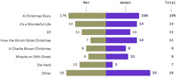
 Reading Axios on Christmas Eve day 2017, I was struck by what appeared at first to be a strange graph showing preferences for Christmas movies divided between men and women. The thing that struck me as strange was the computation for the total votes: the percentages were the average of the men and women percentages. This, of course, is not how you average percentages. What was going on? See Strange Statistics.
Meditations on Mathematics
A compendium of puzzles, problems, math inquiries, and math commentary.